Stock Direction Detection with Transformers
stocks are numbers. computers are good at numbers. what if we had the computer do stocks?
i don’t think anybody has thought of this before.
so, let’s train!
The Models
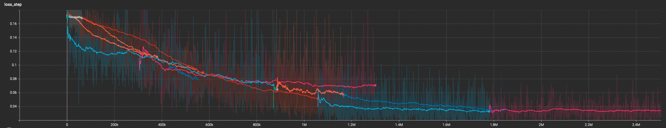
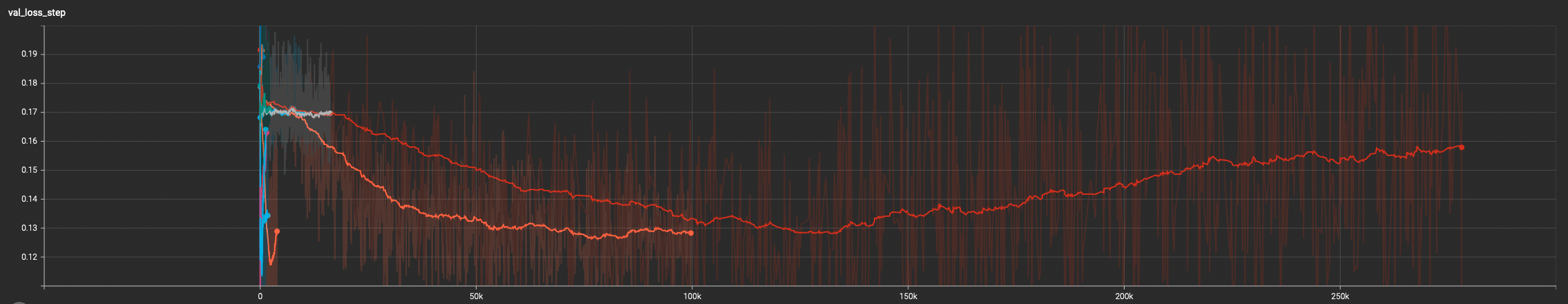
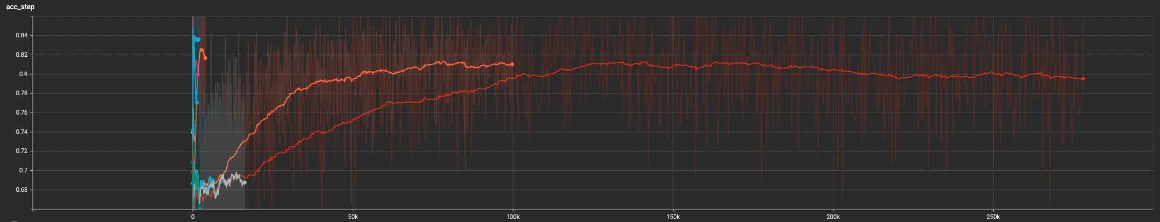
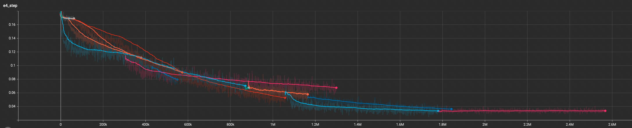
I trained some causal transformer models on my own stock data and it seems to work fairly well.
the models are small and they label each bar of a stock chart with buy or sell beliefs. these are not billion parameter models. you can run a dozen of them on a laptop concurrently.
Training Data
The models are trained on the equivalent of the first charts below, except the training data is just the numbers for the chart data (this isn’t a pixel model, it’s just the price and volume details for each bar serialized across the causal input space).
Also, just a note, in the realized chart examples below, the volume bars look a bit ghosty because I’m using full 4am to 8pm trade data causing the volume bars alternate between very sparse (PM/AH) to very dense (RTH).
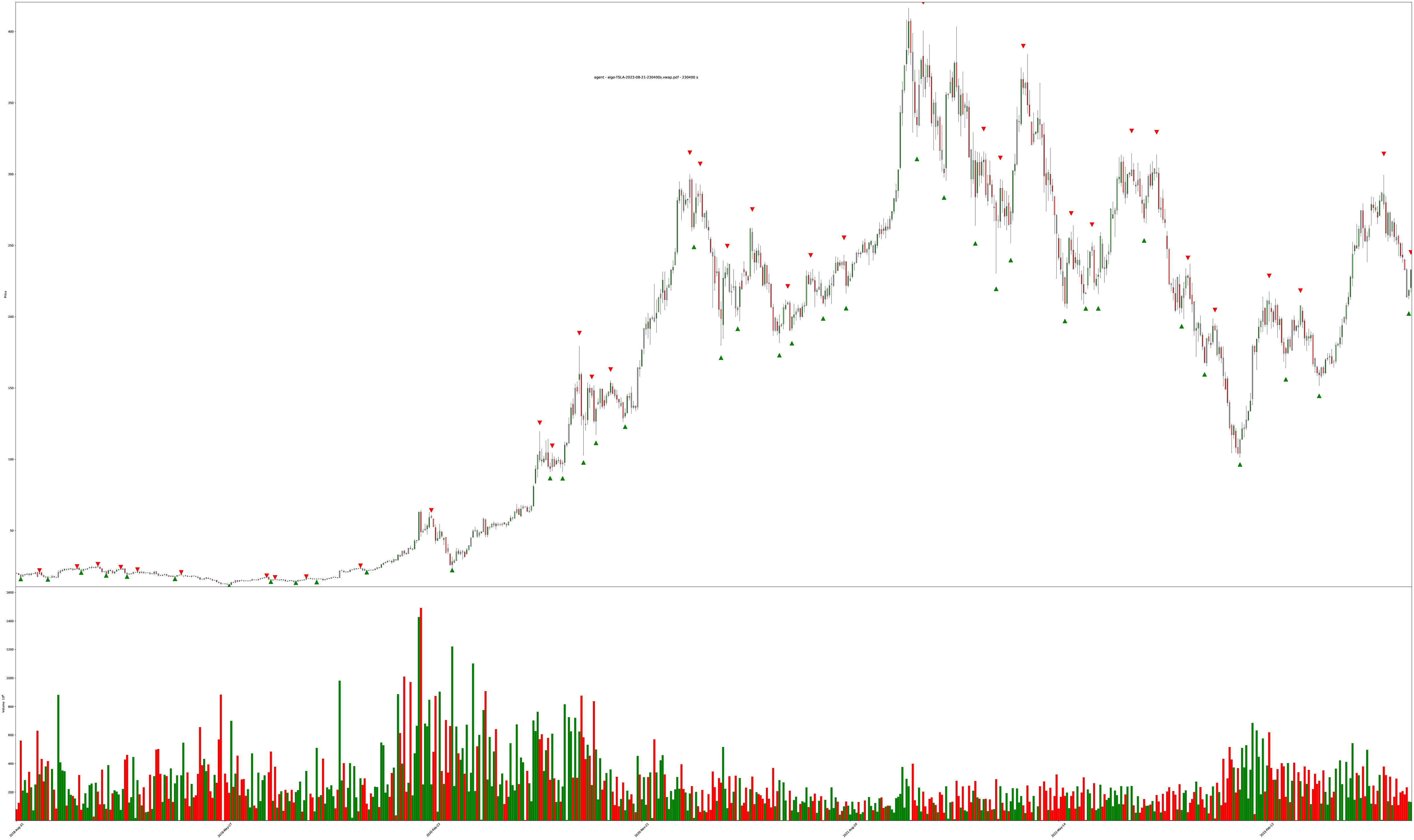
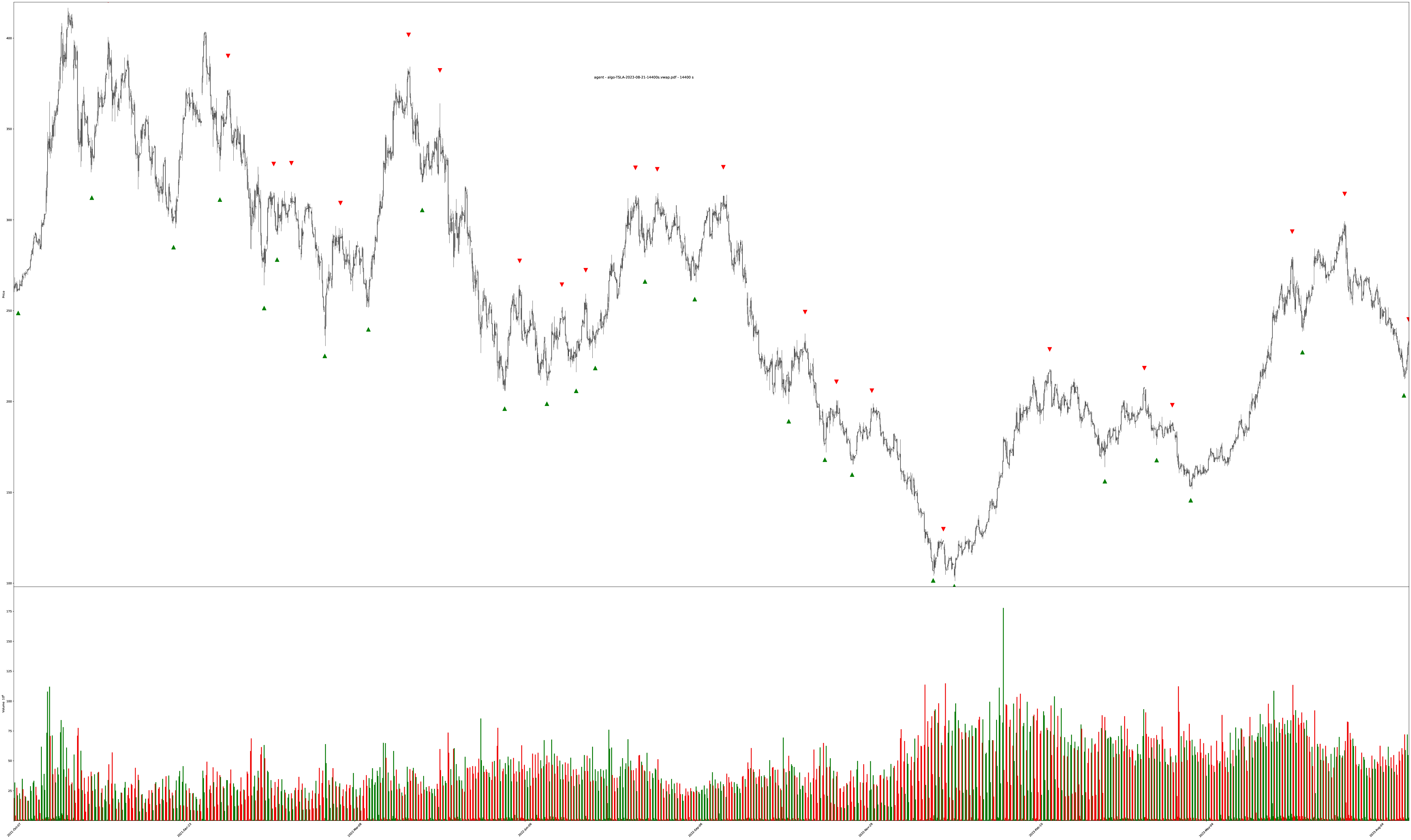
The labeled training objectives are all the triangles1 on the charts. The training targets are generated by looking at the entire chart for the best buy/sell points (since we have the entire history of the chart, we can label by “looking into the future” for picking perfect local minimum and maximum values within sliding time windows).
Training Data Examples
TSLA 5-year chart on 64 hour bars (4 trading days per bar)
TSLA 2-year chart on 4 hour bars
Model-Generated Charts
The charts are pngs here, but there’s also links to the full vector PDFs for zooming into underlying colors better.
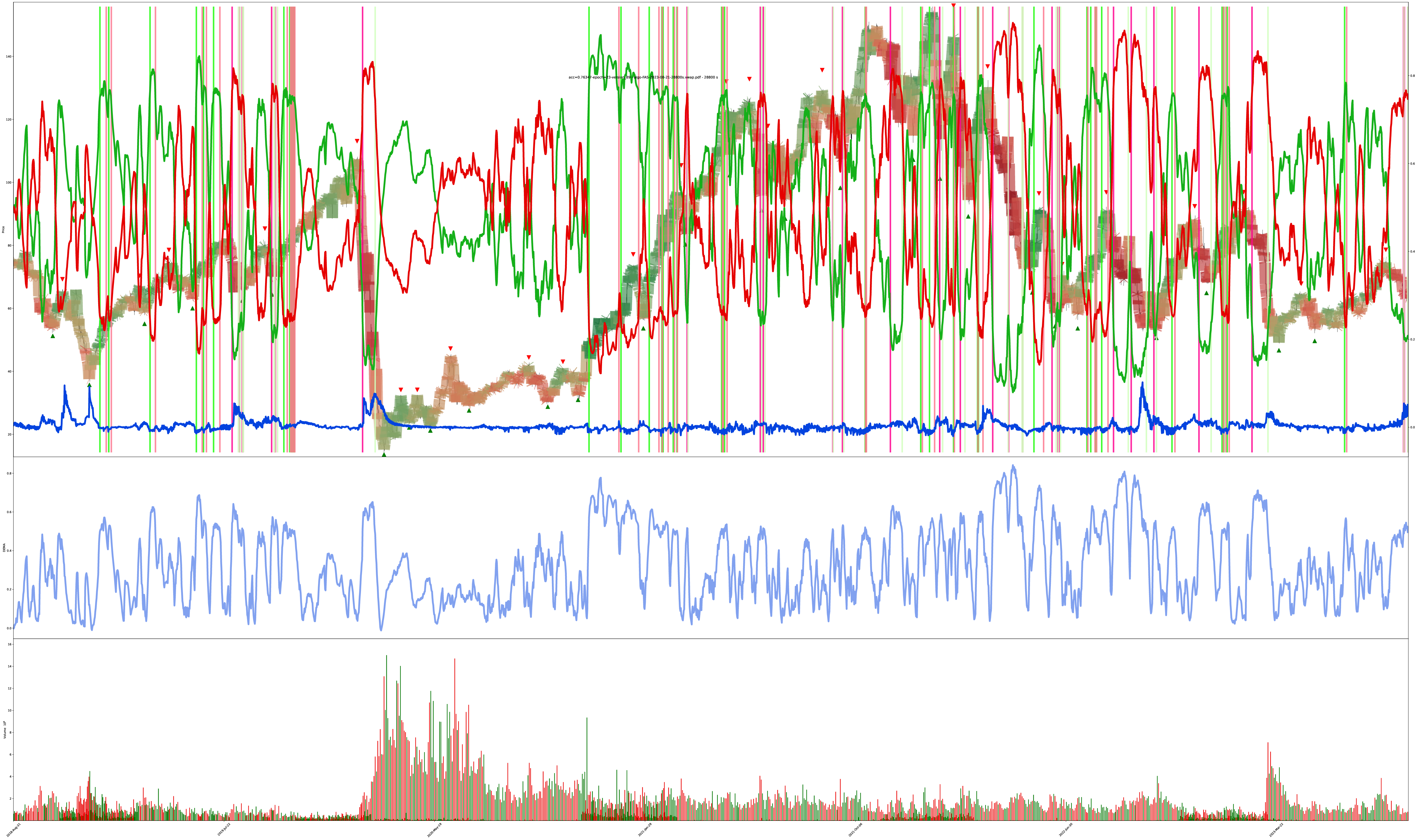
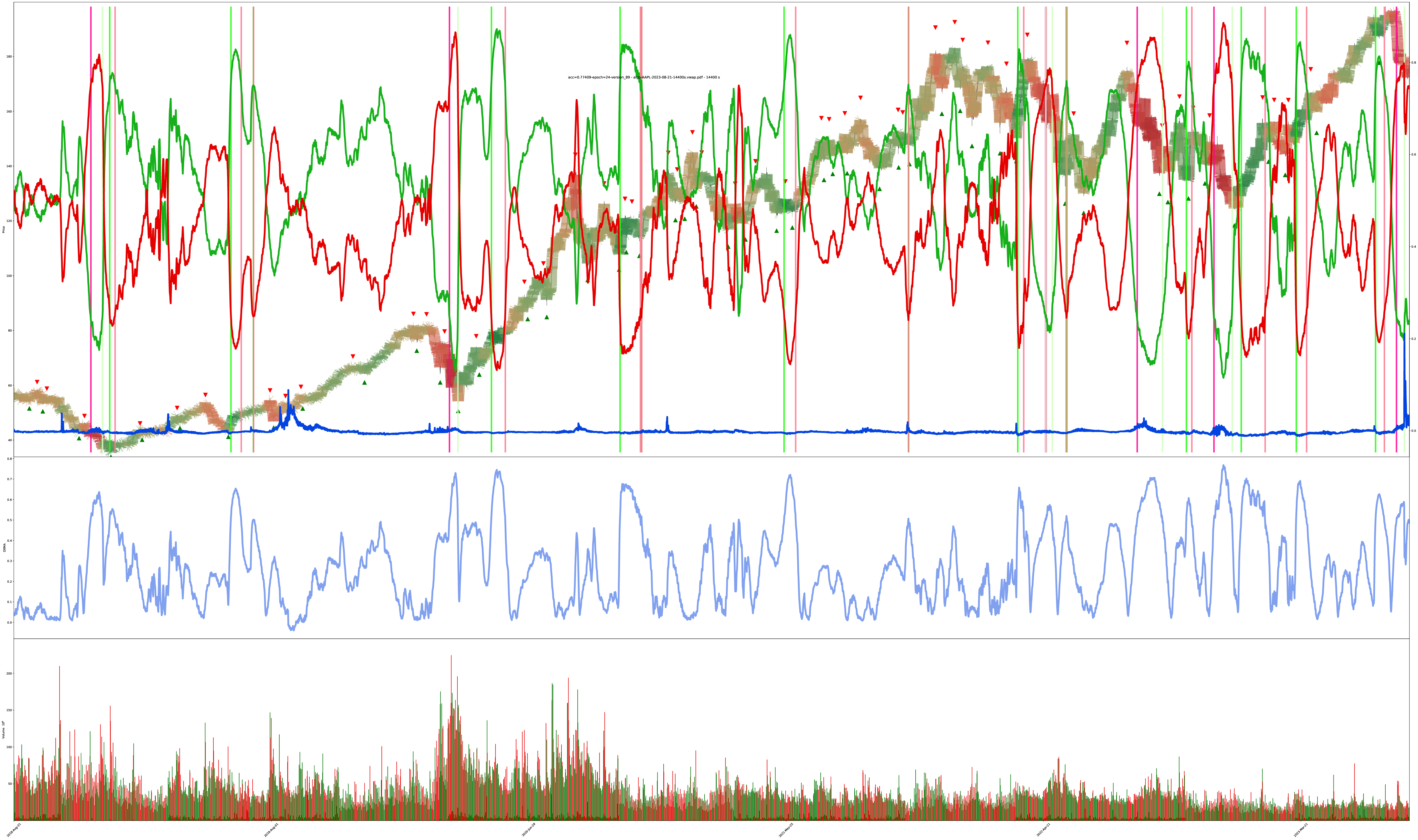
Red v. Green
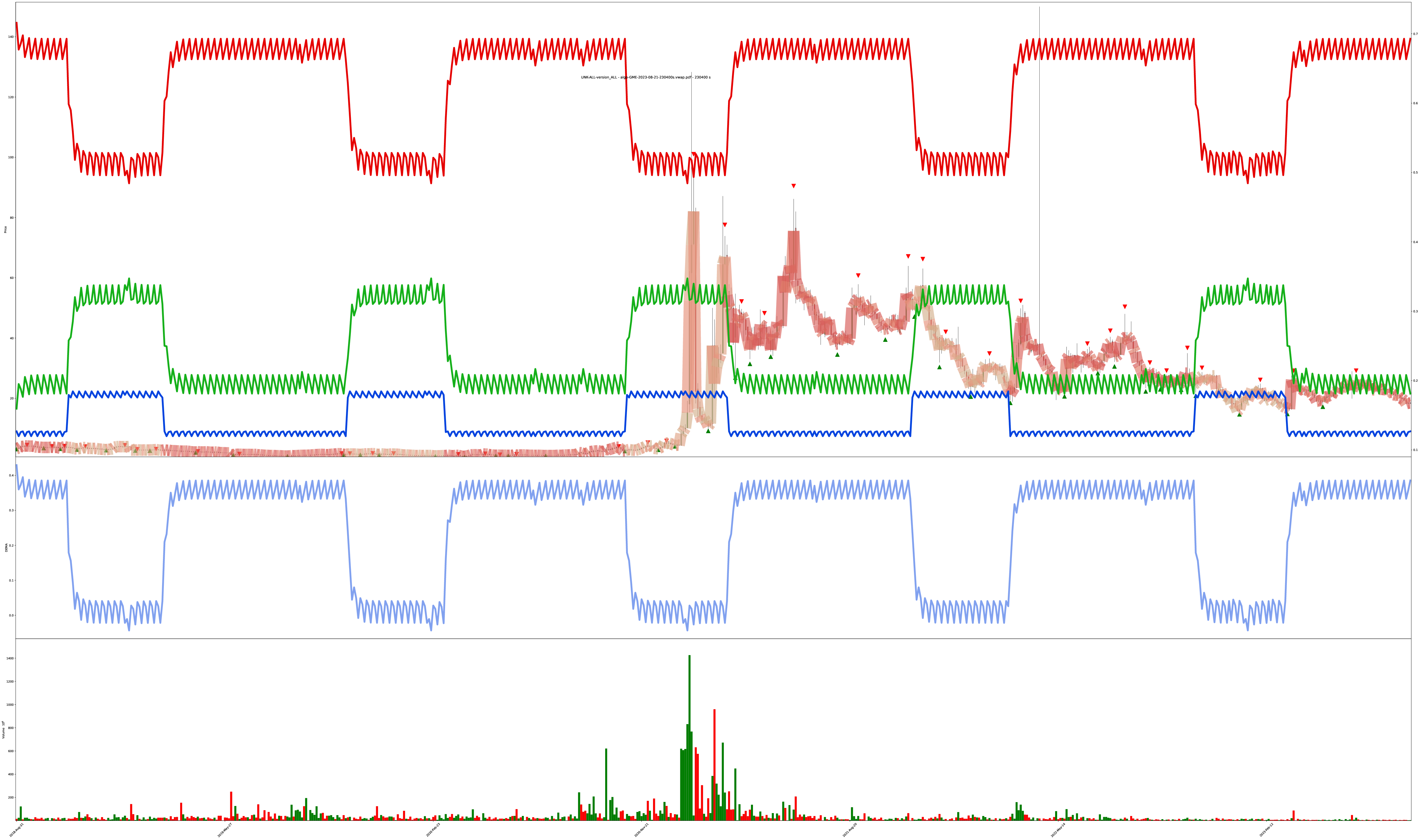
Each bar is highlighted with a mix of 3 values: red (sell), green (buy), blue (do nothing).
The shade of the bar is the strength of the value. A solid dark green is 100% buy while a solid dark red is 100% sell, and combinations of all values are also allowed (so the colors get weak/muddy at indecisive places).
Let’s get ready to view some transformer model output generated on stock data then re-synthesized into graphics! lessgooooooo!
Easy Mode: Chart Has Simple Trends
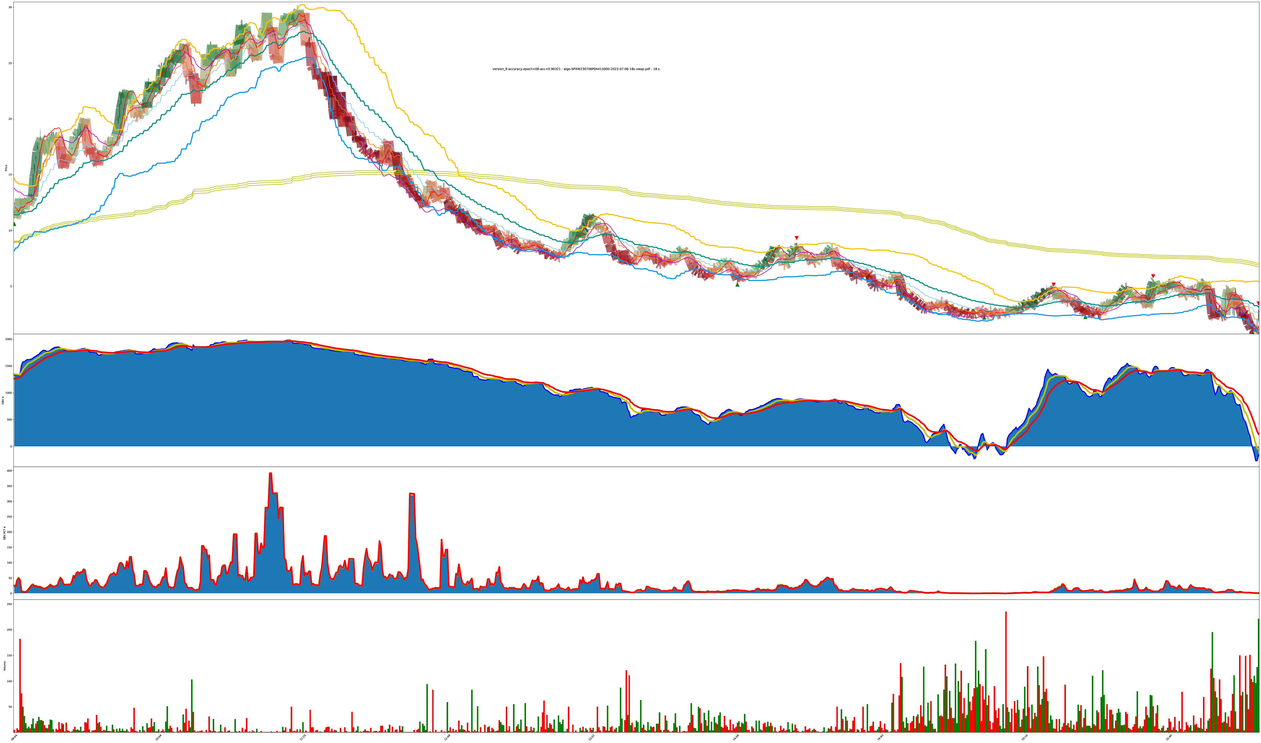
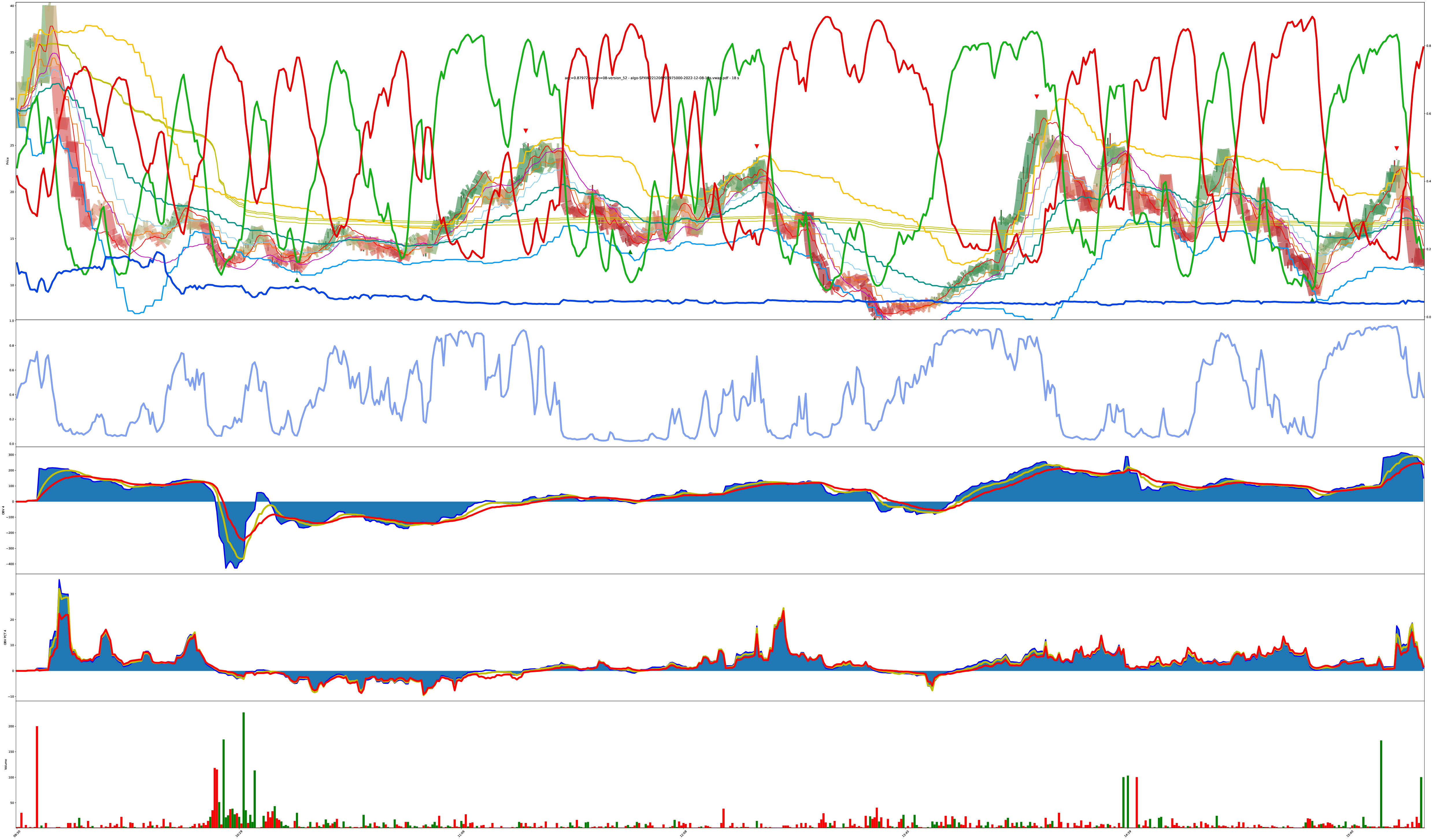
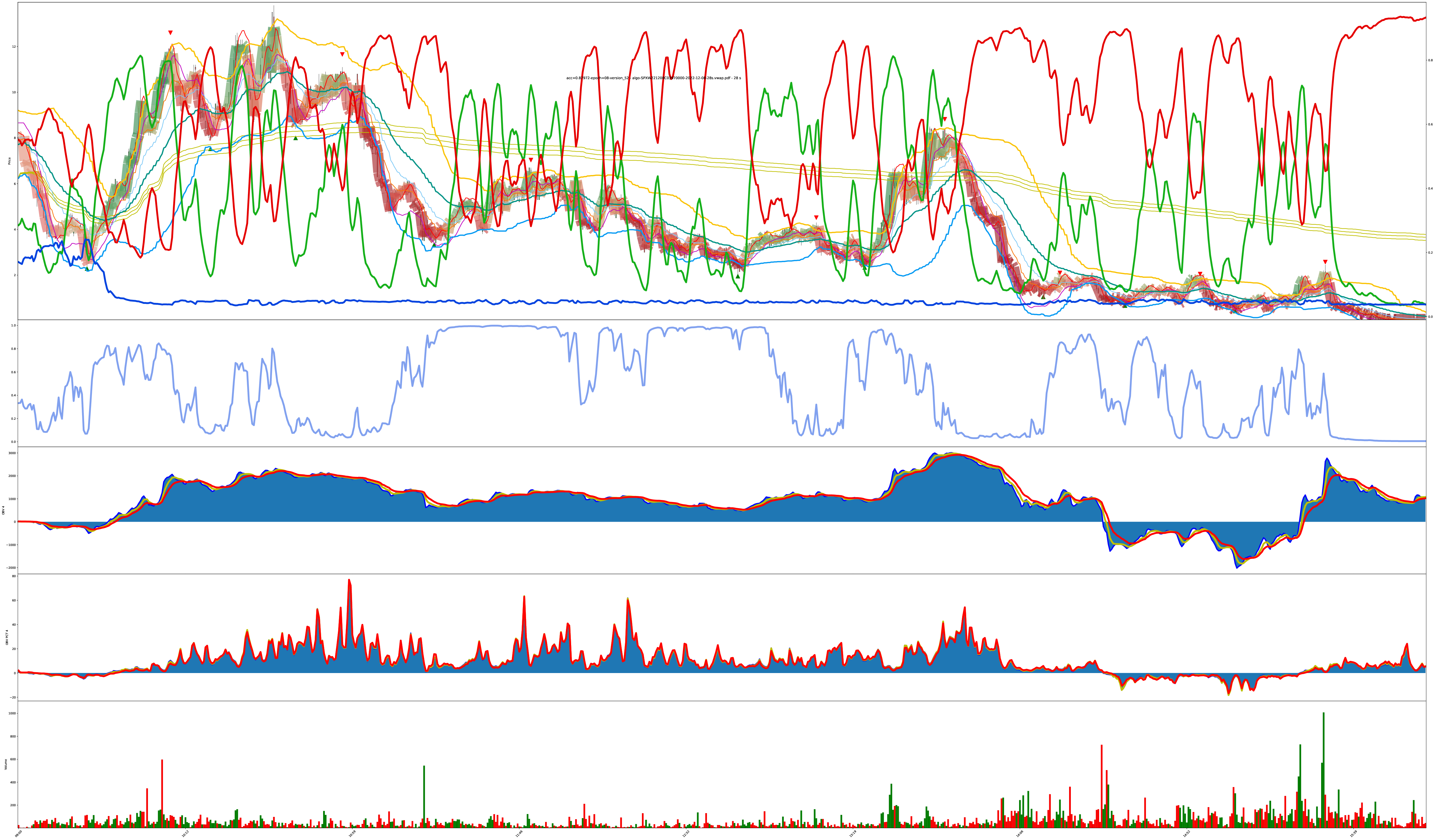
More Difficult: Chart is Bouncy (eval A)
I eventually added the actual red/green/blue decision confidence values to the chart too. You can see the values now in both the shade of the bars and the red/green/blue lines on the chart. The higher the line, the higher the confidence the model has its correct.
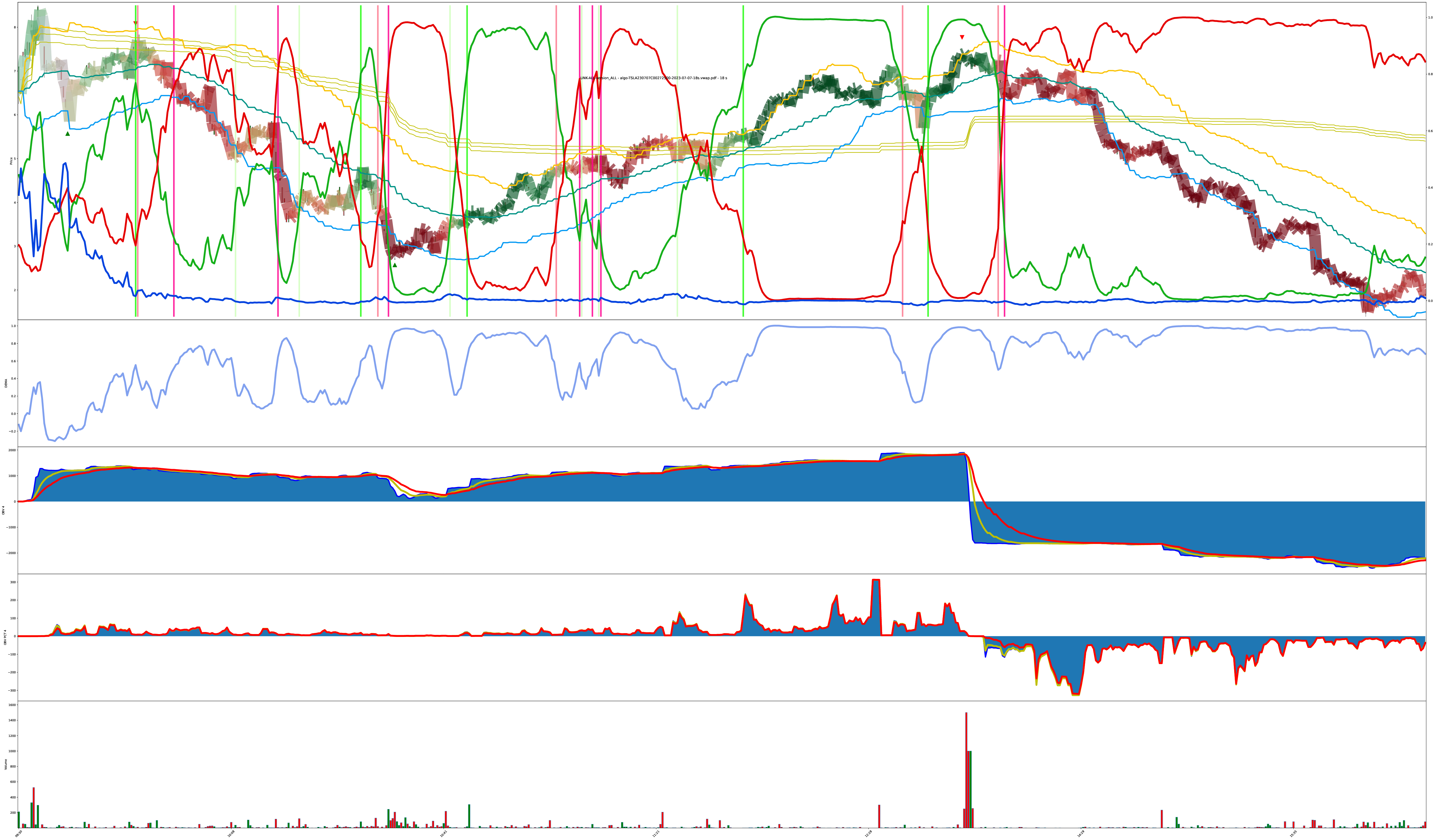
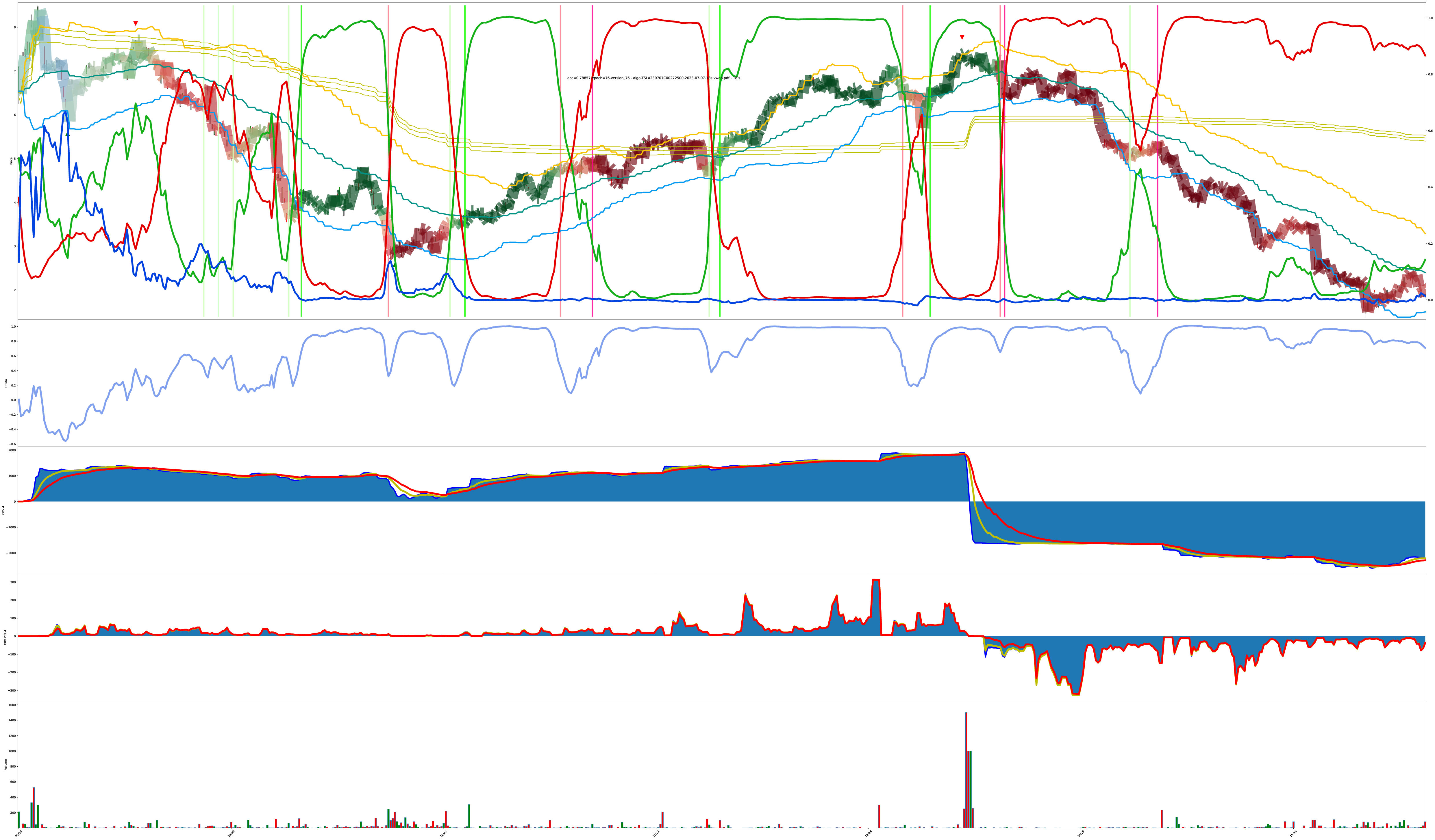
The next two charts are the same symbol, but generated under different model tunings.
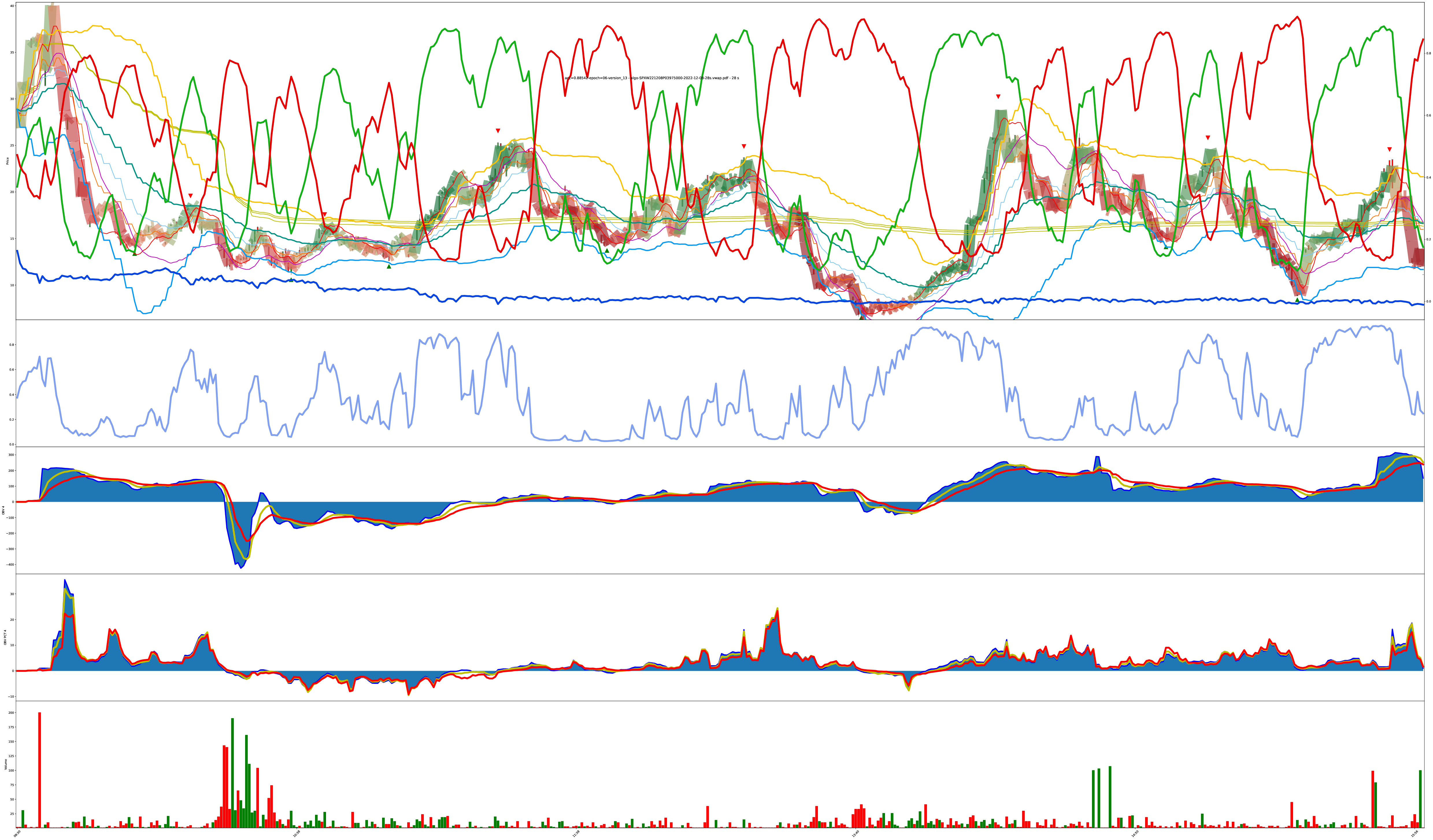
More Difficult: Chart is Bouncy (eval B)
This is the previous chart but at a different bar duration (18s here vs 28s above).
To save you some eye strain, the 28s and 18s evaluations look basically the same.
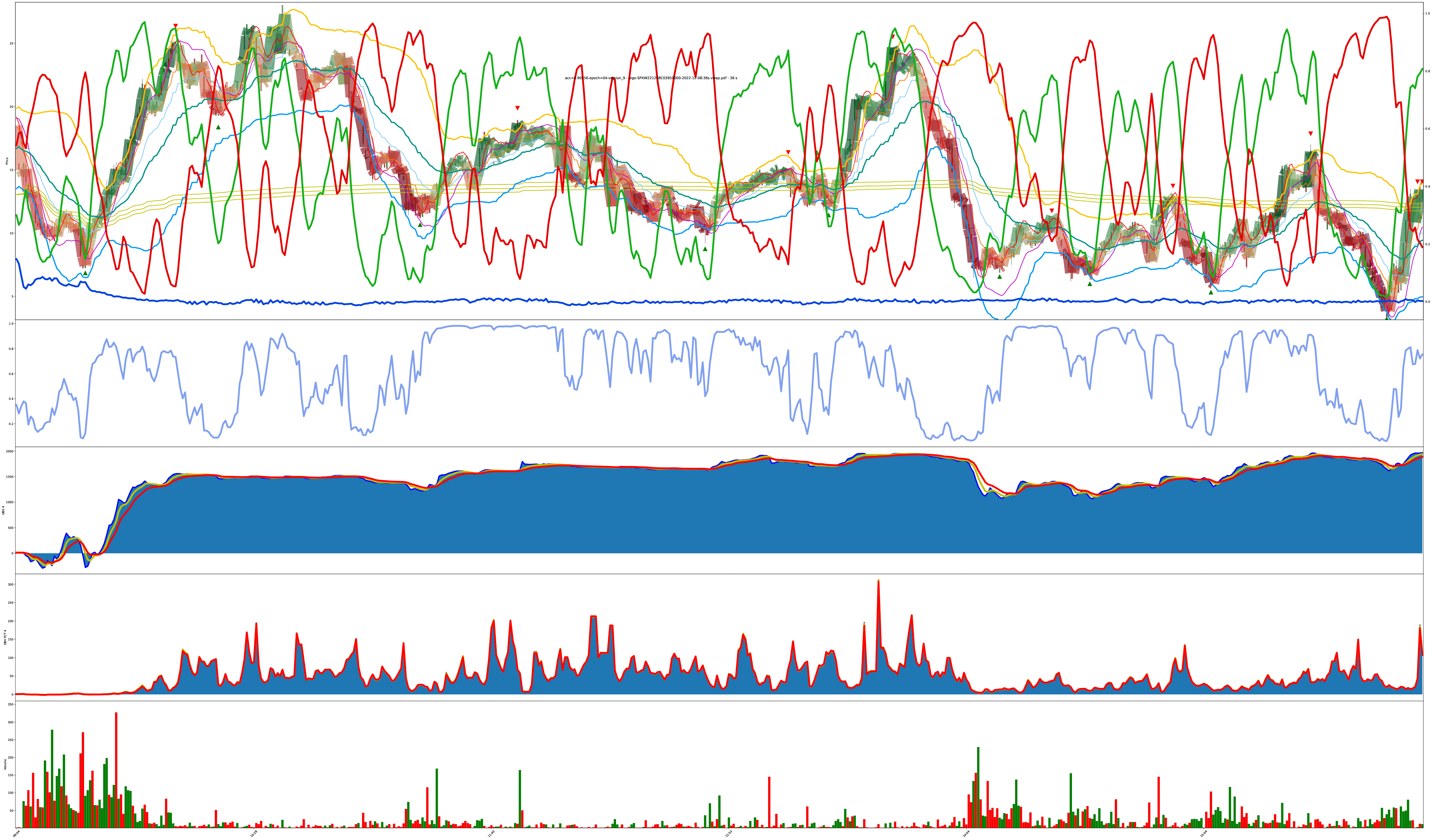
Varying Confidence but Holding Trends
The model is good at tracking strong trends, but so is just a cheap moving average.
Does More Volatility Break It?
What do you think? Does something in here represent tradeable decision points?
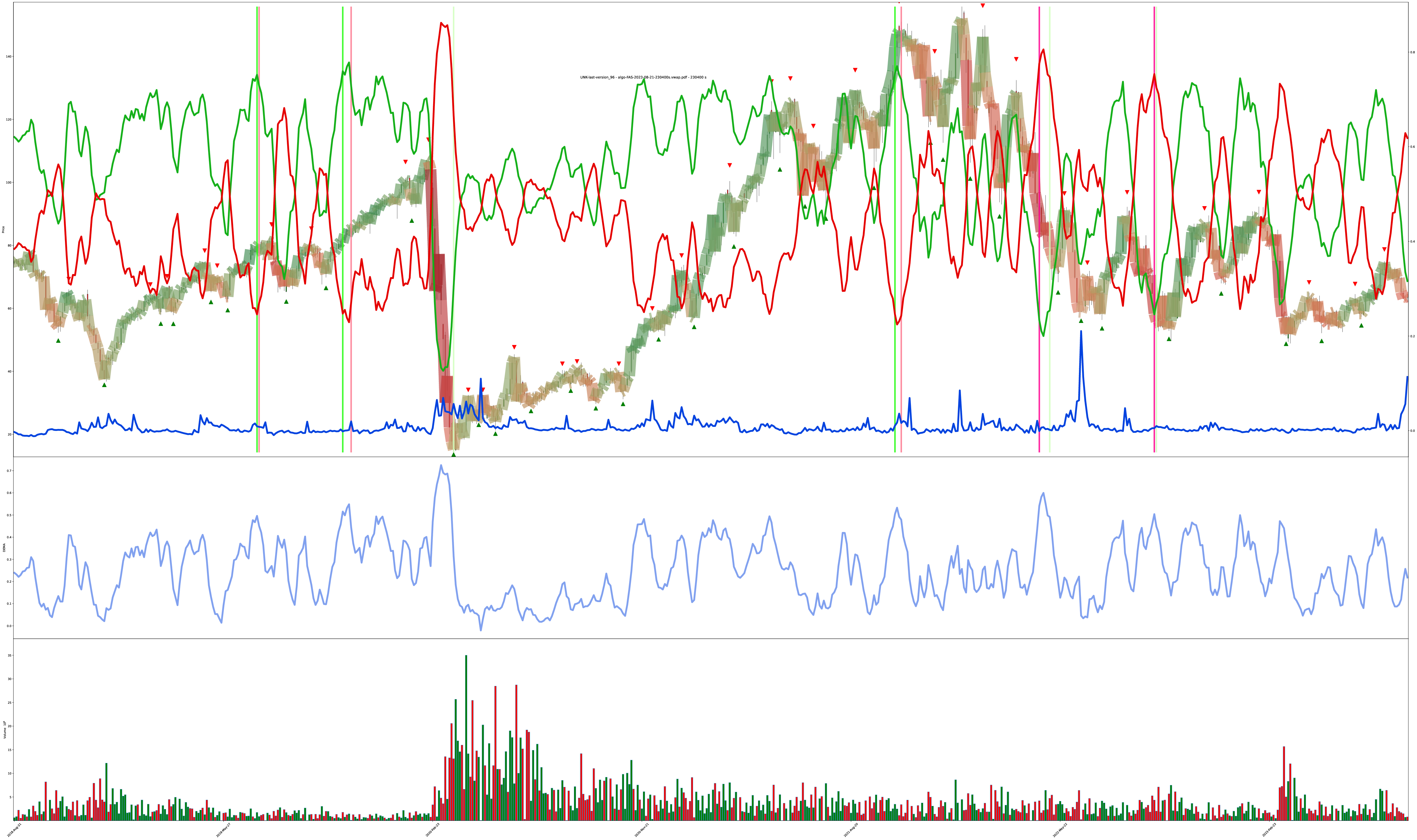
Multi-Year 64-Hour Bars
Then, even more eventually, I added vertical lines to denote when the confidence values cross above or below certain thresholds to easier mark “model belief is growing/declining.”
You can see the model captured the 2020 market crash, got indecisive about recovery, then resumed beliefs during the confirmed uptrend.
Also amusing how the increase in volatility around the 2020 crash caused the “do nothing” value to also spike. The model learned when things “just aren’t right” and maybe it should go away for a while.
Multi-Year 8-Hour Bars
This one looks like noise because here is 5 years of 8-hour bars and decisions into one chart (check the pdf for zoomies), but it still clearly shows the “post-2020 crash indecisiveness” block.
5 years of AAPL 4-Hour Bars
(this one was in the training set, but it’s interesting to see how well it learned the targets; this is obviously much less “decision bouncy” than the other charts because it learned approximately the proper number of bounces it should be doing. though, the model clearly does not like rapid changes. It prefers to ride a confirmed trend instead of complying with the training results of sometimes flipping long/short/long in just a couple bars.)
Even though this was in the training set, you can still see places where it disagrees with my labeled buy/sell decisions. sneaky model. It’s not wrong, in it captures more of an uptrend without bouncing for minor wins, but it’s another modern AI/ML fallacy where people only demand their accuracy goes up, even when the model may have found an equal or better solution and your targets are actually irrelevant or invalid under different assumptions.
Same Charts Different Tunings
These 4 charts are the same symbol just being run under different model conditions.
The thing with these models is: there’s no one right answer in the presence of uncertainty. All the model can do is create a belief then adjust the belief. The next moment of reality is presented to either reinforce the foundation of the current belief or act counter to the established belief. perfect buy low sell high only works under perfect foresight; all else is riding informed probabilities based on experience.
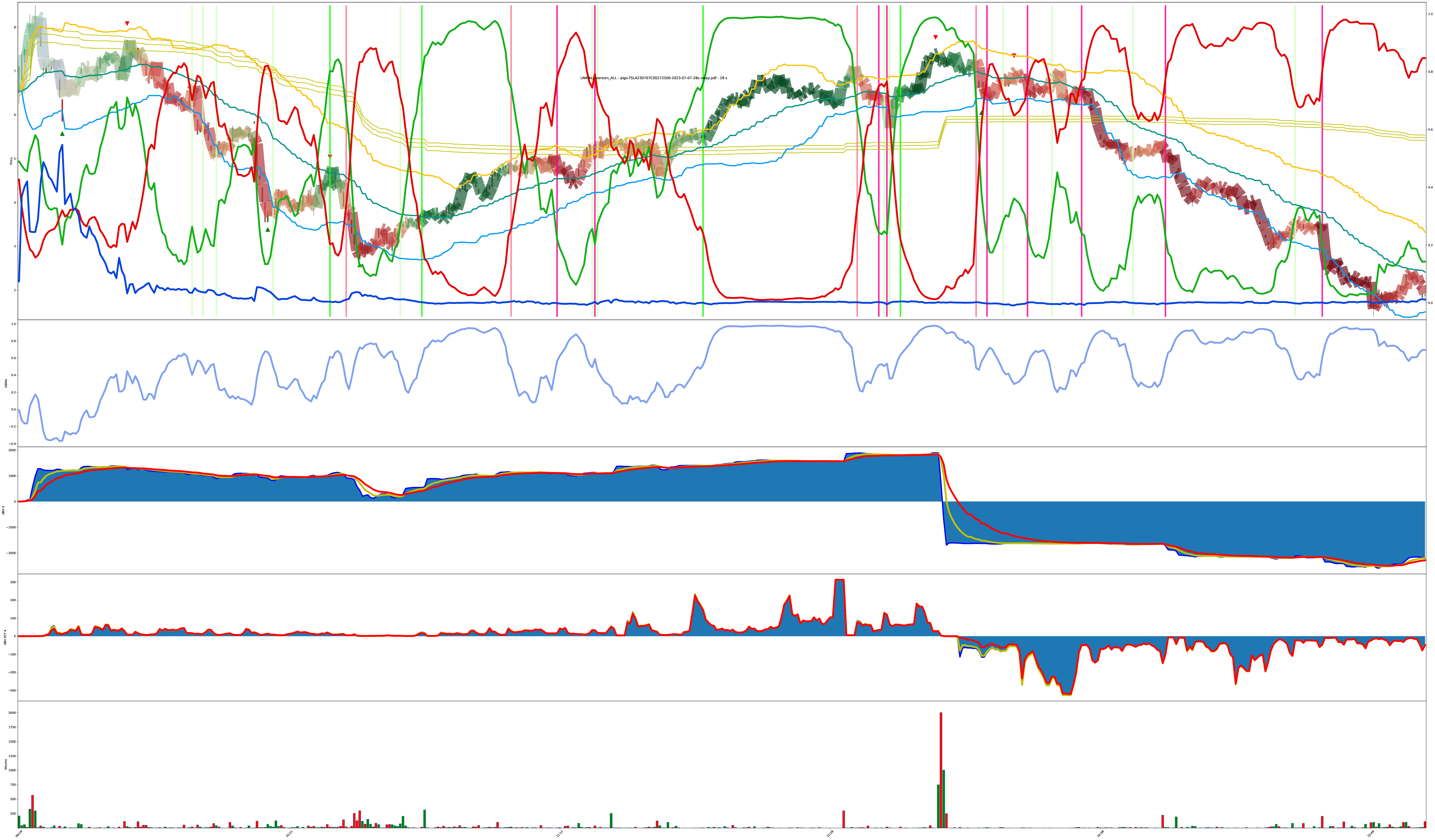
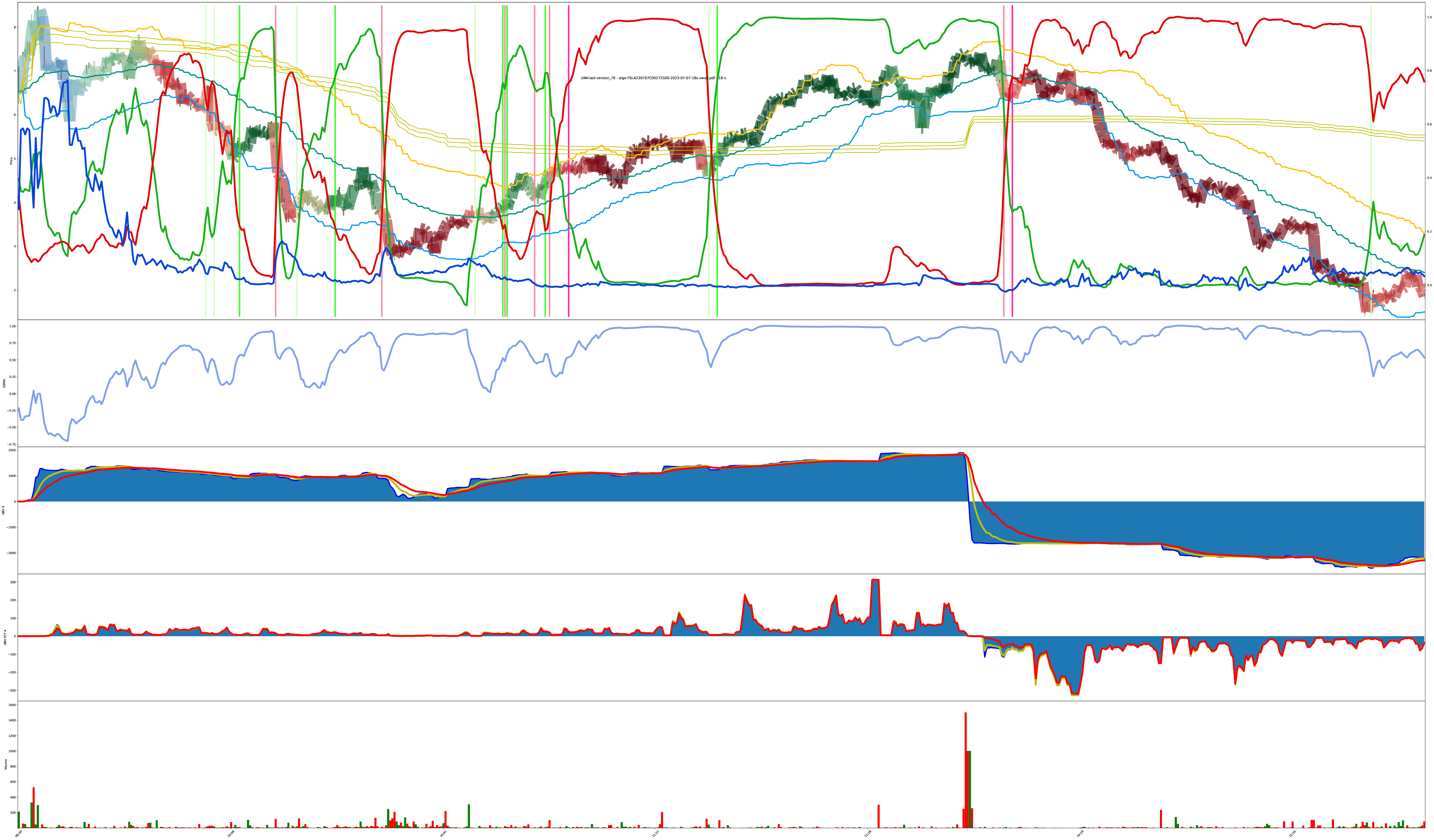
Given this collection of 4 charts, how do they disagree? Is one chart “more correct” than another when operating under the assumption we can’t predict the future? If the model notices a trend change, it makes a decision. Different versions of the model can have different assumptions about what prior events lead to more probable future outcomes.
Final Chart: Rapid Turnaround Detection?
The next 3 charts are also the same symbol just under different model tunings. Do you agree with the model? Why or why not? Support your beliefs.
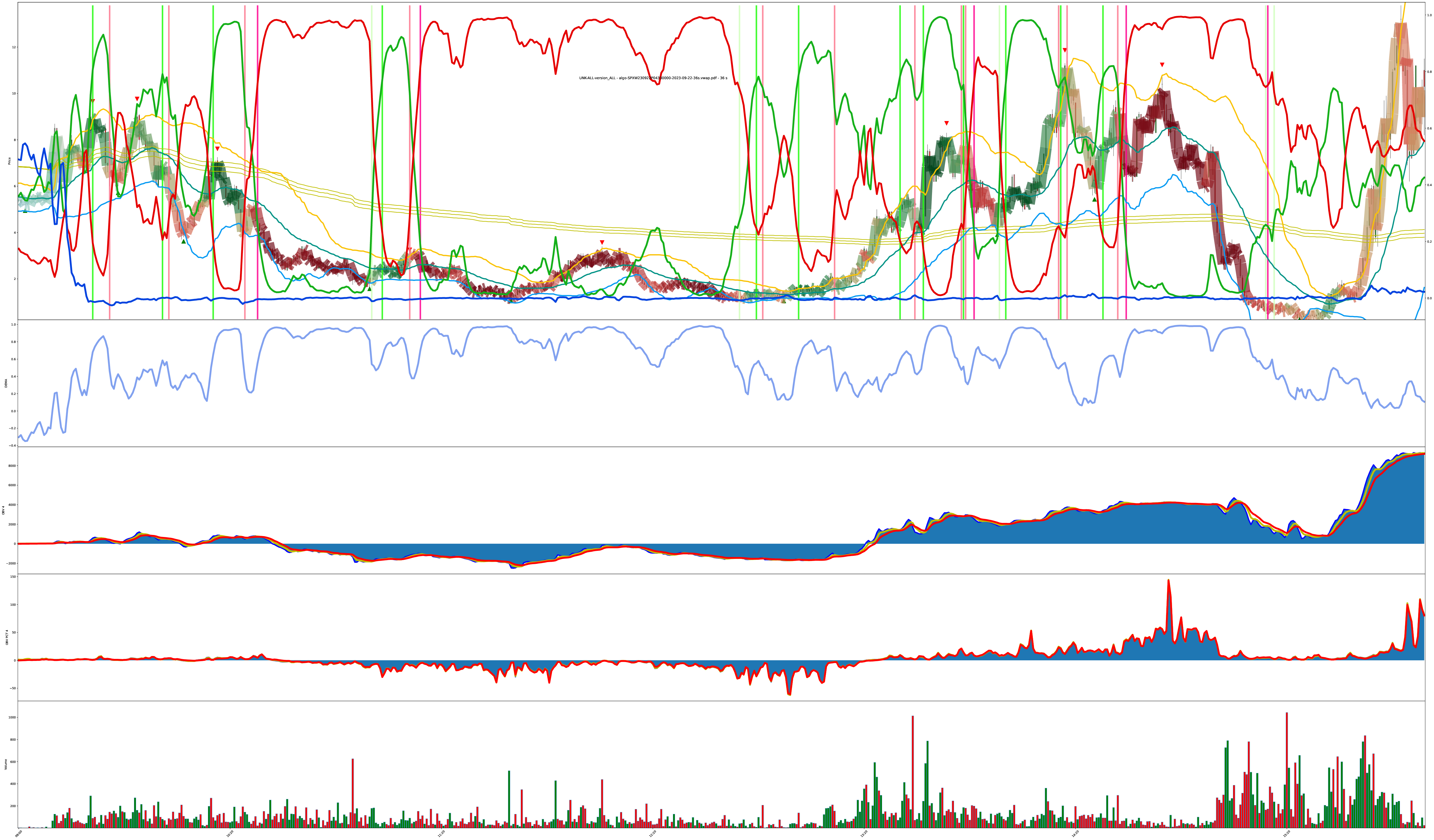
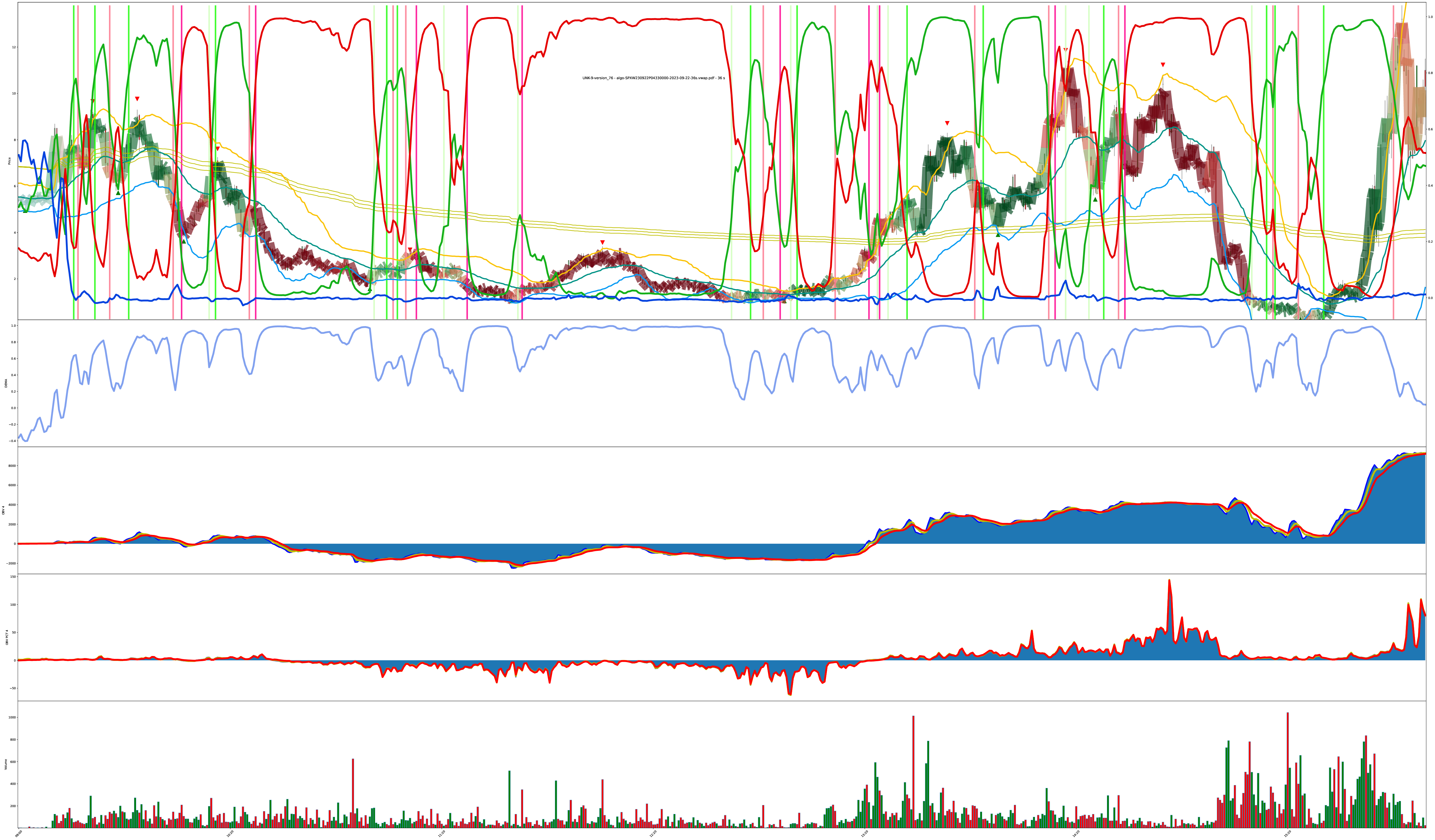

Chart Crime
one time I sent the model an outdated input format mixed up during a refactor.
you can give the model data, and the model must output values, but no other guarantees hold.
you do you, chart; you do you.
Model Details
I found using ██████████ combined with ██████ worked better than the standard methods other people seem to be using.
There’s two models in play here:
- full multi-year stock model (███,███,███ parameters total across ██ hierarchies)
- trained on the 1,000 highest volume stock symbols over the past 5 years at bar sizes of {4, 8, 16, 32, 64} hours
- so, the equivalent of 5,000 5-year symbols at different resolutions to walk over each epoch
- also worth noting: stock data isn’t IID because “the market” tends to move together, which can hurt hold-out testing since all the hold-out data is also part of the stock market itself. The only valid test is to lock a model down in the past then test into the future where no symbols have gone before.
- trained on the 1,000 highest volume stock symbols over the past 5 years at bar sizes of {4, 8, 16, 32, 64} hours
- single-symbols intra-day model (███,███,███ parameters total also across ██ hierarchies)
- trained on a couple thousand day-resolution symbols each at bar sizes of {18, 28, 36} seconds.
- why such weird bar sizes? technically, it shouldn’t matter because THE TRANSFORMER (praise be) can combine lower values into higher concept inner representations as SGD/AdamW commands it to. Maybe I give it 18 second bars but internally it’s assembling its own view of 5 minute bars and evaluating from there because it’s more stable? The capability of hierarchical temporal re-assembly was my working assumption at least: everything’s made up and the inputs don’t matter.
- this was about 1 hour per epoch on a single H100
- trained on a couple thousand day-resolution symbols each at bar sizes of {18, 28, 36} seconds.
The models are ████ blocks deep with ███ attention tentacles per block and the inputs are █████ dimensional ████████ normalized entities. (subscribe to my onlymodels to unlock hyperparameter values and additional tensors-with-benefits!)
The data for both models is from the polygon.io stocks and options historical data APIs2 using my market data API tools then converted to the model input formats I found to work the best.
The models are only using causal price and volume data. The model isn’t aware of symbol names. The model is aware of time-of-day, but not absolute time. Some of the model variants are also aware of day-of-week, but I’m not sure it helped or just eats more tokens. The inputs do not include any additional augmentation like moving averages or indicators or trending details. The models only see the price and volume for each bar then the model becomes internal circuits for matching the target metrics as best it can.
The target of the training is to label all bars either a “buy” (green) or a “sell” (red) or a “do nothing” (blue). The “do nothing” condition is useful for start-of-day bars where we clearly can’t pick a trend yet, so we wait until the first turnaround point of the day before deciding an initial direction. The “do nothing” condition also applies if a symbol is just too low value or low volume to bother with even trying to label (nobody cares if your failed pharma penny stock is bouncing between $0.03 and $0.07 all day with 5 shares trading hands every 2 hours — that’s a big “do nothing” label on all those low price and low volume bars).
also, if you care, the charts are drawn with mplfinance.
Conclusion
it works, it takes less than 5 hours to train a workable version and it takes less than a week for a state of the art version all on a single H100.
these models could be adjusted to specialize more in sub-market-structures better, but that’s more time involving more specific dataset curations and model tuning (and since the servers to train these models in a reasonable time3 cost $1,500/month per server and it’s all just my own bank account burning to the ground, I can’t operate in “individual discovery mode” forever).
feel free to contribute to the cause of unaligned individualized research by sending server cost offset credits using iMessage iMoney iCash to matt@matt.sh or purchase outright AI Indulgences.
power to the players.
fun fact: most indicator triangles in a UI are actually symmetrical; we only perceive them pointing in a common direction we expect, but they are actually equally pointing in three different directions; we just have “horizontal base-line alignment” bias.↩
Why train with options bars too? Any time-series auction-based market data, even from derivatives, will follow the same fractal patterns on basically any timeframe. Since there’s only about 4,000 useful stock symbols, but there’s over 10,000 useful option strikes per day, we can generate a much more useful self-teaching dataset from real world price+volume data by taking in more live market history, regardless of the symbol or asset class origin.↩
These are trainable on my M1 Pro Max, but 1 H100 is 10x faster; so for every 50 hours of laptop time, I can reduce it down to just 5 hours of H100 time.↩